The Butter Yellow Trend Taking Over Interiors
Butter yellow is making a major comeback in interior design, as homeowners increasingly move away from stark monochrome spaces toward warmer, more personality-driven interiors. This nostalgic hue, with its '90s revival appeal, offers the perfect antidote to years of minimalist gray and white schemes.
According to reports, the trending color resonates with people seeking more warmth and character in their homes. However, interior designers are issuing a crucial warning: there's one major styling mistake that can instantly make your butter yellow space look dated rather than fresh and contemporary.
The Critical Design Mistake to Avoid
Designers warn that pairing butter yellow with certain color combinations can quickly push your space into early-2000s territory. The problematic pairings include:
- Cool grays
- Blues
- Silvery finishes
- Whitewashed woods
These cool-toned combinations, according to reports, can make a space feel dated and clash with butter yellow's inherently warm nature. The contrast between warm yellow and cool undertones creates a visual discord that immediately signals outdated design choices.
What Designers Recommend Instead
To make butter yellow feel current and elevated, interior designers suggest embracing warm, complementary elements that enhance rather than fight the color's natural characteristics.
Warm Neutrals Are Key
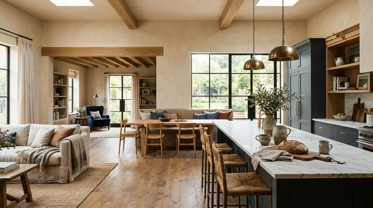
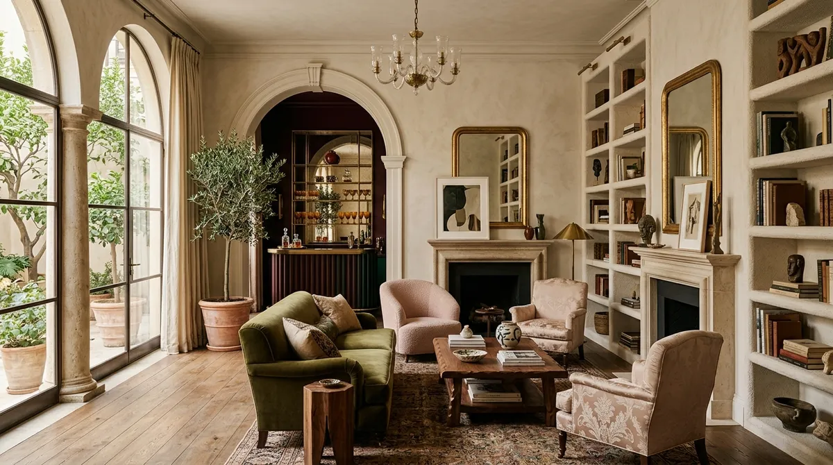
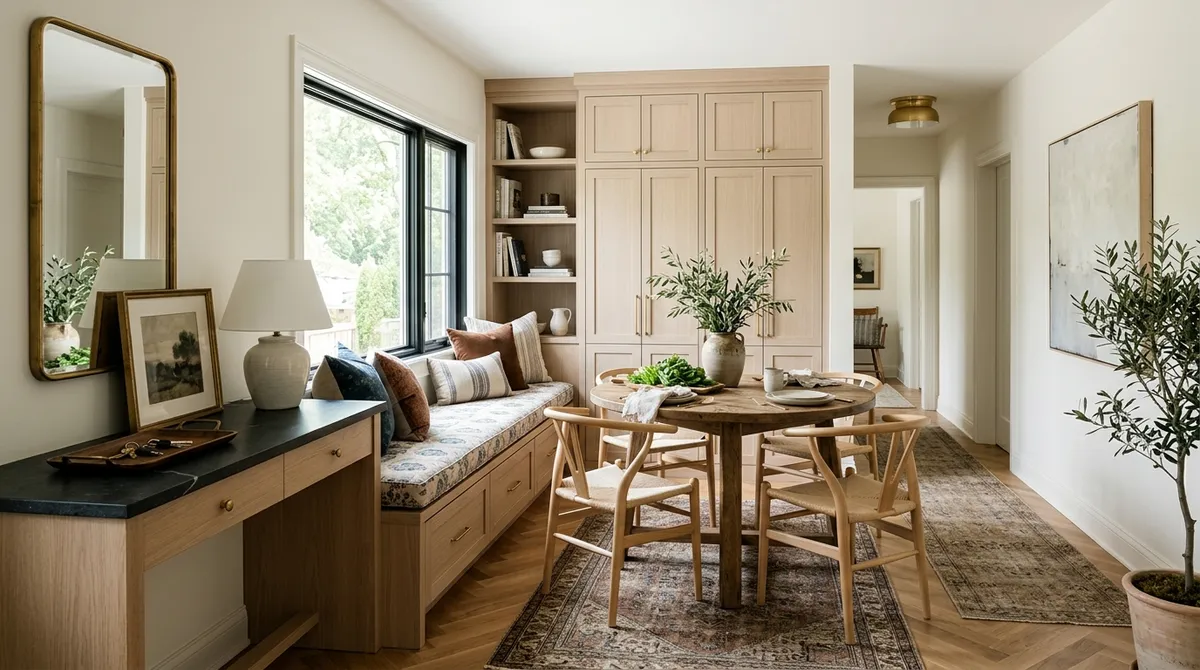
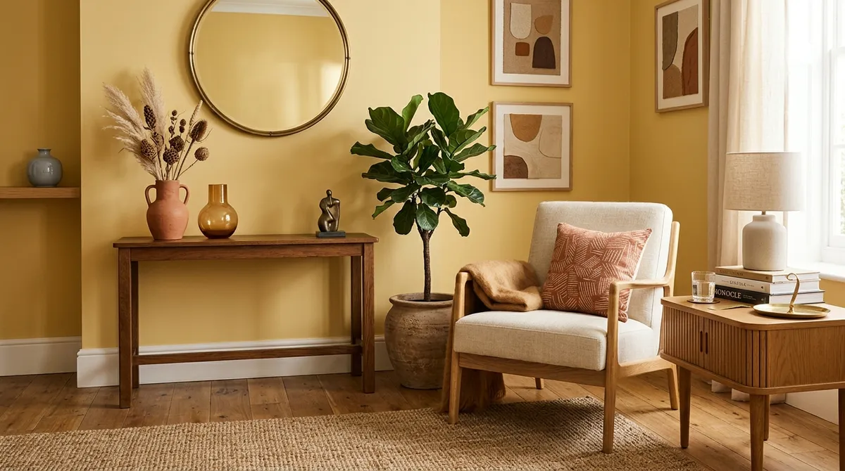
According to reports, warm neutrals provide the perfect foundation for butter yellow spaces. These tones create a cohesive color story that feels intentional and sophisticated rather than accidental.
Embrace Earthy Tones
Earthy color palettes work harmoniously with butter yellow, creating spaces that feel grounded and naturally inspired. These combinations tap into the current trend toward biophilic design and connection with nature.
Choose the Right Materials
Natural materials play a crucial role in modernizing butter yellow spaces. According to reports, incorporating organic textures and finishes helps the color feel fresh and contemporary rather than retro in an unflattering way.
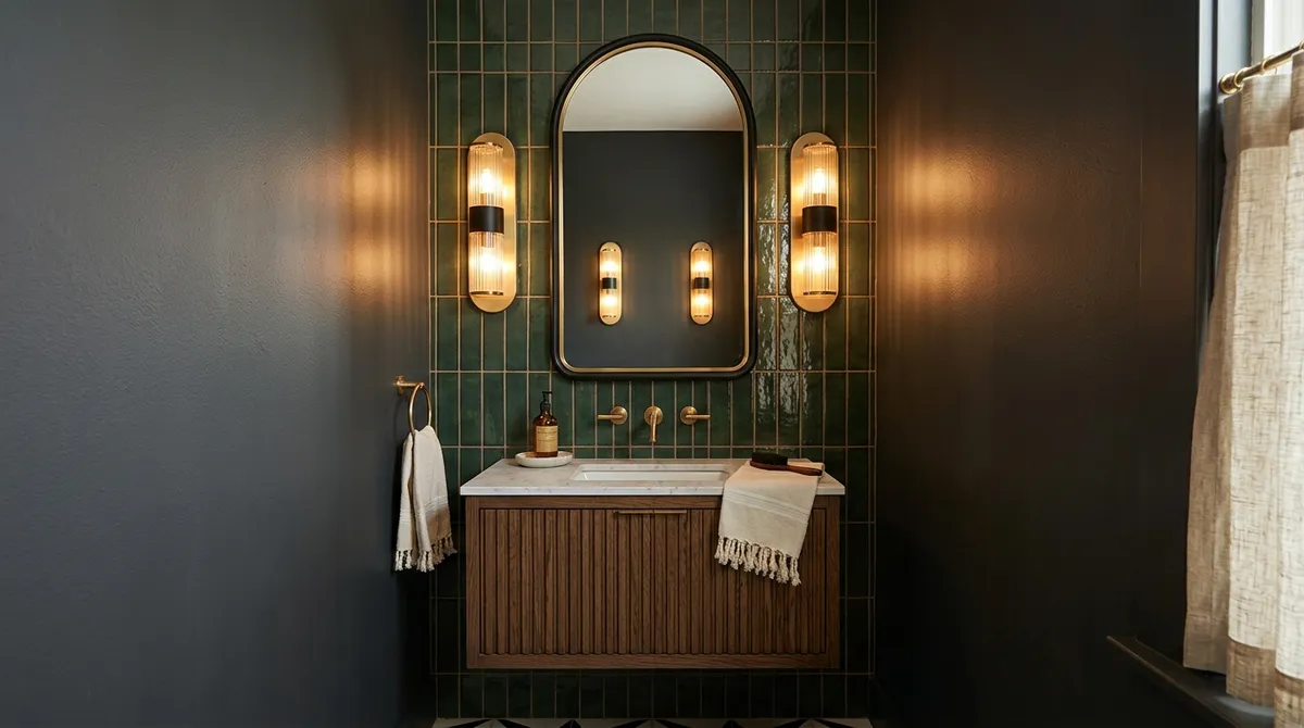
Metallic Finishes That Work
The choice of metallic accents can make or break a butter yellow room. Designers recommend steering clear of silvery finishes in favor of warmer metal tones.
Brass and Bronze Elements
According to reports, brass and bronze finishes complement butter yellow beautifully, enhancing its warm undertones while adding sophisticated shine. These metals have a timeless quality that prevents the space from feeling trendy in a way that will quickly date.
Wood Choices Matter
The type of wood finishes you choose significantly impacts how current your butter yellow space appears.
Skip Whitewashed Woods
Designers warn against whitewashed wood pieces, which can create the same cool-warm clash that makes spaces feel dated.
Embrace Vintage Wood Pieces
Instead, according to reports, vintage wood pieces with warm, rich tones complement butter yellow's nostalgic appeal while maintaining a current aesthetic. These pieces add character and depth without competing with the wall color.
Making Butter Yellow Feel Current
The key to successfully incorporating this trending color lies in understanding its warm nature and choosing complementary elements accordingly. According to reports, the goal is to create spaces that feel vintage-inspired rather than simply dated.
Focus on Cohesive Color Stories
Successful butter yellow rooms tell a cohesive color story where every element supports the warm, welcoming atmosphere. This means carefully considering everything from throw pillows to light fixtures.
Balance Nostalgia with Modernity
While butter yellow taps into '90s nostalgia, the surrounding elements should feel fresh and intentional. This balance prevents the space from feeling like a time capsule.
The Bottom Line
Butter yellow represents a significant shift in interior design preferences, signaling a move toward warmer, more personalized spaces. However, success with this trending color requires careful attention to complementary elements. By avoiding cool-toned pairings and embracing warm neutrals, earthy tones, and appropriate finishes, homeowners can create spaces that feel both nostalgic and thoroughly modern.
The difference between a dated butter yellow room and a stylish one often comes down to these critical pairing decisions that designers emphasize.